NextJs 13 image component
Learn how to preserve image aspect ratio with Next 13 Image component
In this article, I will be sharing how to properly display images with the Nextjs image component.
Next Image component helps in optimizing and caching images on our sites which can increase performance significantly strongly advise to use it.
Recently was working on a project using NextJs v13 and discovered all my images are stretched and losing aspect ratio.
So I went through their docs and discovered some changes were made to the Image component for v13 you can check the migration guide here if you are planning to migrate or use this version.
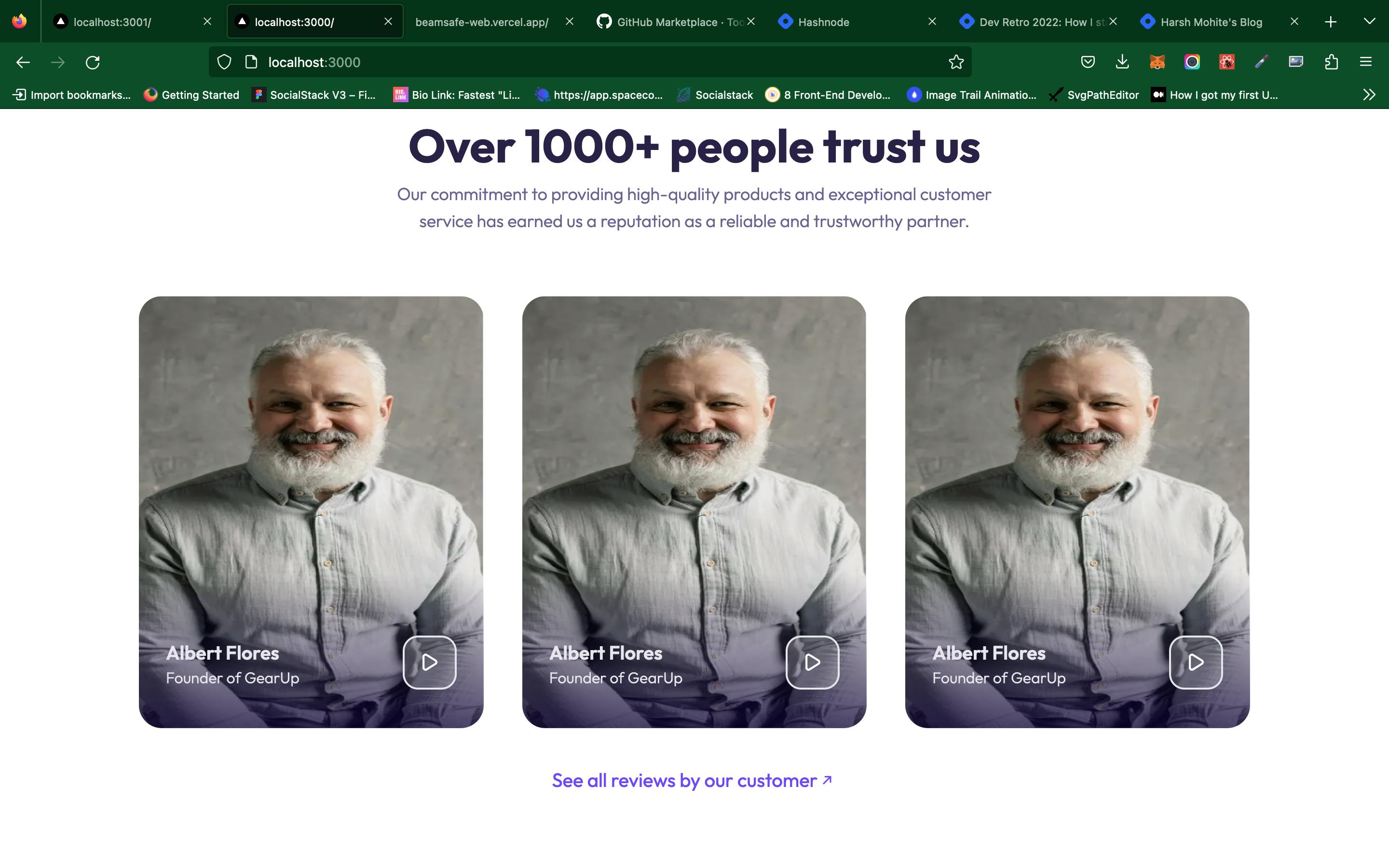
I was using the fill prop as their doc stated and also having my parent container relative and giving it a width and height, below is a code sample and outcome.
//NB: i am using tailwind classes
<div className="w-[10rem] relative h-[10rem]">
<Image
    src="/assets/images/man.png"
    alt="img"
    fill
/>
</div>

As you can see, the image looked stretched but most people won't notice it. i have seen companies go to production with images like this weirdly.
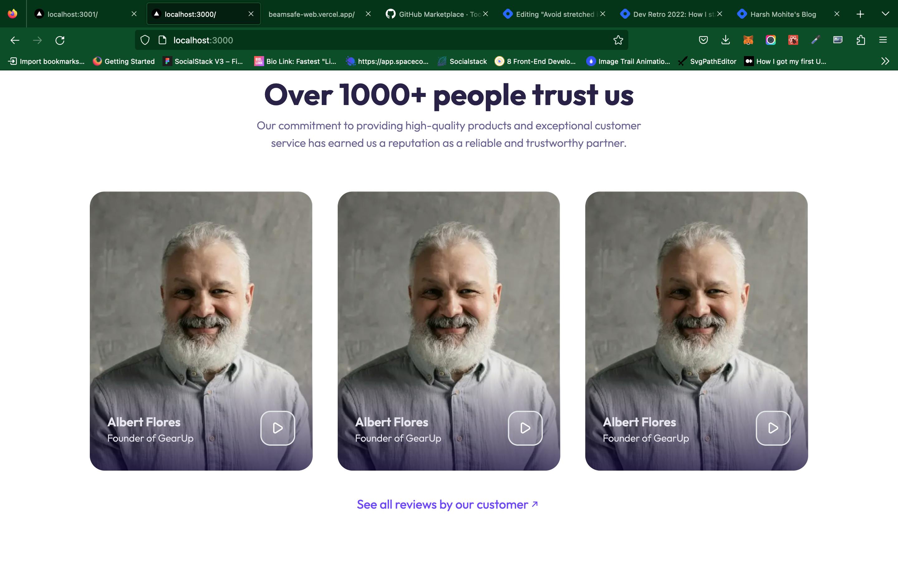
So I did a bit of research and found out I forgot to set the image object-fit CSS property which is very vital if you want to keep the image aspect ratio.
//NB: i am using tailwind classes
<div className="w-[10rem] overflow-hidden relative h-[10rem]">
<Image
    src="/assets/images/man.png"
    alt="img"
    className="object-cover object-top "
    fill
/>
</div>

Voila, can you spot the difference? I set the object-fit CSS property to be object-cover so the image fills the height and width of the parent container without losing its aspect ratio, and the object-position CSS property was used to set the image position base on the requirement. check out MDN to read more about object position CSS property.
I hope you learned from this article hope to see you next time✌️